From A to Z with D3
The running joke at my coding school was that front end students only knew how to do data visualization. It was both funny, as most of us never built a data visualization project as part of our curriculum, and stress-inducing, because it made us wonder if it was a skill we needed to have. As it turns out, data visualization is sort of a niche in front end development. So far, I haven’t had to do any of it professionally, but as someone who loves maps, I wanted to finally learn some D3 basics. I went through a few tutorials that handed me data and files and code. Like most coding tutorials online, these started at step F, or P, never A. So I wanted to write something that goes from A to Z. Where do you get data for maps? How do you turn that data into something you can use? How do D3 projections work? The best way to solidify knowledge is to write about it or teach it, so follow along with me as I build a map from scratch using Natural Earth, ogr2ogr and D3 (v3). I’ll link to various sites throughout this piece, but I’ll also link everything at the bottom of the post for quick access. This post is based off the tutorial I made my first map with, Mike Bostock’s Let’s Build A Map.
The first step is getting data. While the UI of the Natural Earth site leaves a lot to be desired, it’s a great tool to get data for maps. It’s free for personal, academic and best of all, commercial use. Before we get started, we need to decide what to map. I’m going to make a map of Australia and its eight states/territories.

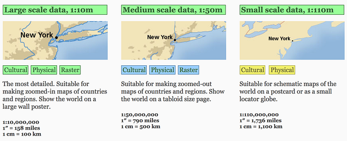
If you click the “Downloads” section of Natural Earth, you’re given some scale options. For this example, I’m going to pick the “large scale data” and then “cultural” option, which brings me to some more choices. When dealing with map data, you might see “admin 0” or “admin 6” or any admin number through 9. There is no standard for admin levels, but generally, they represent different levels of data. I’m going to pick “Admin 1 — States, Provinces.” While the photo makes it seem like it’s just a map of the UK, the reality is it’s boundary data for every country in the world. Once the file is downloaded and unzipped, you’ll see a folder with a bunch of files in it. What we’re interested in is the shapefile. We’re going to trust that the file has data for every country in the world, but we’re only interested in Australia, so how do we extract that data? That’s where ogr2ogr and the command line come in.
For the next step, we need to make sure we have a few things installed. We’re going to use Homebrew to install GDAL (the Geospatial Data Abstraction Library).
Type this into the command line:
brew install gdalNote: The assumption is you have Ruby installed. If you don’t have Ruby installed, or don’t have an updated version, you may need to brew install ruby or brew upgrade ruby first.
Then we’re going to install TopoJSON (v1):
npm install -g topojson@1Note: The assumption is you have Node installed. If you don’t have Node, you can download Xcode and brew install node.
Once everything is installed, using the command line, cd into the Natural Earth folder that you’ve downloaded. Now we’re going to use ogr2ogr to get data for Australia. The following can be copy and pasted into the command line (or wait a minute if you want to find data for a different country):
ogr2ogr \
  -f GeoJSON \
  -where "ADM0_A3 IN ('AUS')" \
  subunits.json \
  ne_10m_admin_1_states_provinces.shp
Let’s break this command down line by line.
run ogr2ogr
 format my data into GeoJSON
 only give me the data that matches the Alpha 3 country code “AUS”
 name the new GeoJSON file subunits.json
 look in this file to get me the data I need
If you’re interested in another country, you can find a list of Alpha 3 codes for every country here.
After running this command, you won’t get any feedback from the command line, but you should now see a new file (subunits.json) in the folder. Go ahead and open that in your text editor. When you open it, you’ll see it’s a GeoJSON featureCollection of the country you’ve chosen.
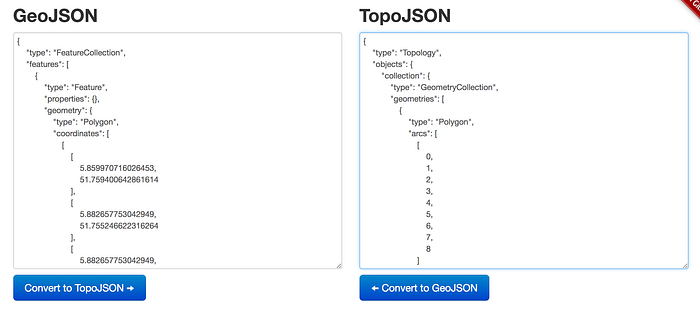
Next we’re going to convert our GeoJSON to TopoJSON. Why? Because TopoJSON reduces file size dramatically. You don’t need to do this, but it’s been my practice thus far so I will do it again for this exercise. I really like when people build easy to use sites that do cool, useful things and I found one that converts data from one form to another. Check it out here! You can copy and paste the whole GeoJSON file and hit the convert button. You’ll notice that the TopoJSON is no longer a featureCollection, but a geometryCollection. This will be important later on. Save this new code into a separate .json file or simply replace the existing GeoJSON code in subunits.json with the TopoJSON code.

Next we need to actually start coding, so create an index.html file and include the D3 and TopoJSON scripts.
<!DOCTYPE html>
<html>
  <head>
    <meta charset="utf-8">
    <script src="//d3js.org/d3.v3.min.js" charset="utf-8"></script>
    <script src="//d3js.org/topojson.v1.min.js"></script>
    <title>Australia Map</title>
  </head>
  <body>
  </body>
</html>
We’ll start a server so we can see what we’re doing. Type this into your command line:
Python -m SimpleHTTPServer 8080and go to localhost:8080. Luckily, it doesn’t take a lot of D3 code to see our progress. Let’s create a script tag, call d3.json, tell it what file to look at, give it a callback, pass it our data, and console.log our data.
<!DOCTYPE html>
<html>
  <head>
    <meta charset="utf-8">
    <script src="//d3js.org/d3.v3.min.js" charset="utf-8"></script>
    <script src="//d3js.org/topojson.v1.min.js"></script>
    <title>Australia Map</title>
  </head>
  <body>  <script type="text/javascript">
    d3.json("subunits.json", function(error, aus) {
      if (error) return console.error(error);
      console.log(aus);
    });
  </script>  </body>
</html>
In your console you should see a very large object. So how do we get the data to visualize? D3 projections can be tricky, especially with maps, because they requires some unique information. We’ll take a look at both the geo.mercator and the geo.albers projection methods. First we need to define a place to put our information. Mike Bostock suggests using svgs because they’re easier to style, so that’s what we’ll do! Let’s change our script tag. We’ll create some variables to define the width and height and then give them to the svg as attributes, as well as a class.
<script type="text/javascript">
  var width = 800,
  height = 600;  var svg = d3.select("body").append("svg")
    .attr("width", width)
    .attr("height", height)
    .attr("class", “map");  d3.json("subunits.json", function(error, aus) {
    if (error) return console.error(error);
    console.log(aus);
  });
</script>
With D3, we also need to define a path and a projection. We can also do these with variables, but they’ll be defined within the D3 code block. We’ll replace our console.log from above with some new logic. We’ll start with the mercator projection. The translate is easier to understand, with the width and height being divided by 2, placing our country in the middle of our svg. The scale and center are a little trickier. Plug this code in and see what happens.
<script type="text/javascript">
    var width = 800,
    height = 600;    var svg = d3.select("body").append("svg")
      .attr("width", width)
      .attr("height", height)
      .attr("class", "map");    d3.json("subunits.json", function(error, aus) {
      if (error) return console.error(error);      var projection = d3.geo.mercator()
        .translate([width / 2, height / 2])
        .scale(900)
        .center([133, -25]);      var path = d3.geo.path()
        .projection(projection);      svg.append("path")
        .datum(topojson.feature(aus, aus.objects.collection))
        .attr("d", path);
    });
</script>
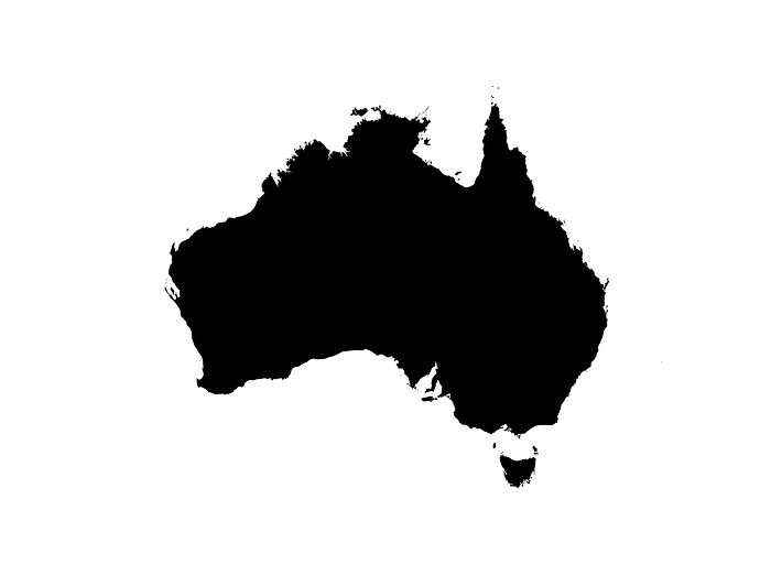
You should see a decent sized map of Australia in the top right of your screen.

If you’ve chosen another country, you likely have a blank screen. As long as you don’t have console errors, you’re in a good place. The center attribute in the projection is really doing most of the work here. If you google search the latitude and longitude of Australia, you’ll see it’s very similar to the coordinates I’ve put in to let the mercator projection know where to center our map. Since the svg has a class of map, I’d suggest giving it a border and playing around with the scale and center a little to see how it works. Adjust the numbers minimally though because if you adjust them dramatically you’ll likely end up with nothing on the screen.

If you’ve chosen to follow along with a different country, find the longitude and latitude (adjust the scale if needed) and get your country on the screen. Now that we have an understanding of how projections work, we’re going to switch our projection to geo.albers. Why? The D3 api references says this about mercator projections, “it introduces severe area distortion at world scale.” This should sound familiar as it’s how most maps are drawn. This projection is the reason that things far from the Equator are appear much larger than they actually are (like Greenland and Antartica). I’ve linked to a really cool website that lets you find a country and drag it around a map to see the mercator projection in action. If you want to check out the math behind the projection method, the wikipedia page is pretty heavy.
Replace the current projection with this orthographic one:
var projection = d3.geo.orthographic()
   .translate([width / 2, height / 2])
   .scale(900)
   .center([133, -25]);
This is a very clear example as to how different projections effect the style of your map. Check out some other map projections here.
So let’s switch to geo.albers and see how it looks.
var projection = d3.geo.albers()
  .translate([width / 2, height / 2])
  .scale(900)
  .rotate([-133, 50])
  .center([0, 25]);
Some things are similar, but it’s pretty different. You can check out the geo.albers wikipedia to see the math. I’m not a math person, but I do want to understand what’s going on. Just like the mercator projection, you can see how adjusting any of these numbers can dramatically change your map. Or make it disappear completely! If you’ve tried to map something with D3 before and had nothing appear on screen and had no errors in the console, it’s most likely a bad projection that’s placed your data way off screen. This is essentially what we’re doing:
.rotate([-longitude, num, optional num)])
.center([num, latitude]);OR, in math terms:
.rotate([lambda, phi, gamma)])
In our geo.albers projection add ad a third index of 10 (gamma) in rotate and see what happens! Axis rotation is tricky. Here’s a good reference.
So now we have a map of Australia. But what about the states? If you look at the TopoJSON file, you’ll notice things called “arcs.” These arcs are what’s going to define our boundary lines for all our states. Let’s talk about paths, since we’ve used them in our code already. A path is what allows our svg to draw the data we give it. You can read more about how paths work here. Right now, we’ve only given it the data needed to make a path of the entirety of Australia. We’re going to now create an individual path for each province in Australia using the arcs. These arcs, when all mapped out, will of course give us the correct shape for Australia.
To create individual paths for our boundary lines, we need to turn our TopoJSON back into GeoJSON. I mentioned earlier that our TopoJSON is now a geometryCollection, but to map these smaller boundaries, we need a featureCollection, which is what GeoJSON originally gave us. Luckily, we can do this with a few lines of code:
svg.selectAll()
  .data(topojson.feature(aus, aus.objects.collection).features)
  .enter().append("path")
  .attr("class", "subunit")
  .attr("d", path);
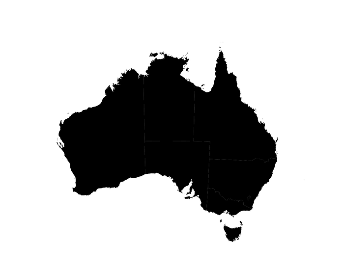
They’re pretty faint (in fact, if on a non-retina display, I can’t see them at all), but we can see our states. If you can’t see them, I promise they’re there. We’ve added a class of “subunit” to all our paths. We can add some styling to our boundary lines by give them a more prominent stroke in a style tag. Let’s also give our boundaries a hover state.
<style media="screen">
  .subunit{
    stroke: white;
    stroke-width: 1px;
  }
  .subunit:hover{
    fill: magenta;
  }
</style>
Now we’ve created a map from scratch!
This data didn’t come with any state names, so I’ve included some more code in my repo that adds an id to every region and I’ve made a simple switch statement to display the state names.
You can find the full code here.
Thanks for following along! Below are all the helpful links from this post.
D3.js
D3 projection methods
Axis Rotation
Country codes (Alpha 3, etc)
GDAL
ogr2ogr
Convert GeoJSON to TopoJSON
Paths
Mercator: True Size
Mercator projection
Albers projection
Mike Bostock
Mike Bostock’s Let’s Build a Map
GitHub Repo
